| 
|
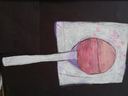
The Lollipop on the right was done in colored pencil. I like the way that you can see the dimension of the middle part of the lollipop that always sticks out more than the rest. I could have done a bit more on the shading to make it look more like a wrinkled wrapper that is laying behind it. I enjoyed working with the colored pencils and am looking forward to purchasing some quality colored pencils to use in the future at home.
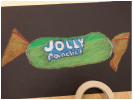
The Jolly rancher on the left was done in oil pastels. I like the way that the lettering on the wrapper turned. The white letters with the blue background really stand out. The wrapped sides of the wrapper have good lines and shading to make them looked wrinkled. They are a bit off center and Jolly ranchers are more square so those two things could have been done a bit better. I think that the colors really pop off the page.
The Jolly rancher on the left was done in oil pastels. I like the way that the lettering on the wrapper turned. The white letters with the blue background really stand out. The wrapped sides of the wrapper have good lines and shading to make them looked wrinkled. They are a bit off center and Jolly ranchers are more square so those two things could have been done a bit better. I think that the colors really pop off the page.
 RSS Feed